Hindi Ako Mayumi!
Illustrations and layout for Hindi Ako Mayumi!, written by Joshene Bersales and published by Anvil Publishing, 2026
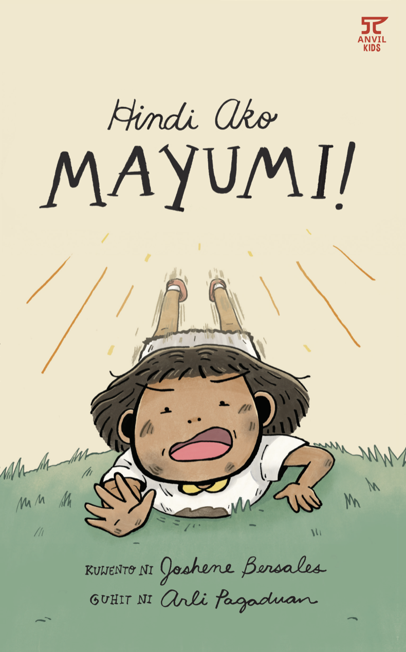
Awarded an Honorable Mention in the 2023 PBBY-Salanga Prize, Hindi Ako Mayumi! (I’m Not Graceful!) is a Filipino chapter book written by Joshene Bersales and published by Anvil Publishing. It tells about a girl named Mayumi who doesn’t like her name, as it means graceful, refined, or modest. And Mayumi is anything but those words! This story of becoming one’s own person, despite the expectations and remarks of other people, opens the conversation of kids’ sense of agency and discovering more of themselves as they navigate various life experiences.
I was overjoyed when Joshene approached me to create the illustrations, and she specifically requested for them to be created with ink!
Since Hindi Ako Mayumi! is a contrast between the supposed meaning of Mayumi’s name and what her true nature is, we played with contrast (clean vs. dirty, big vs. small, neat vs. gritty, straight vs. curly, roundedness vs sharpness) in the character designs and text treatment.
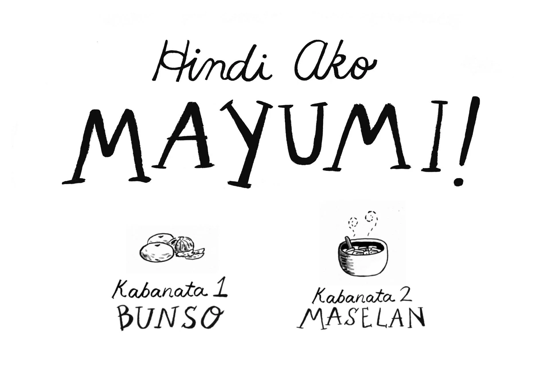
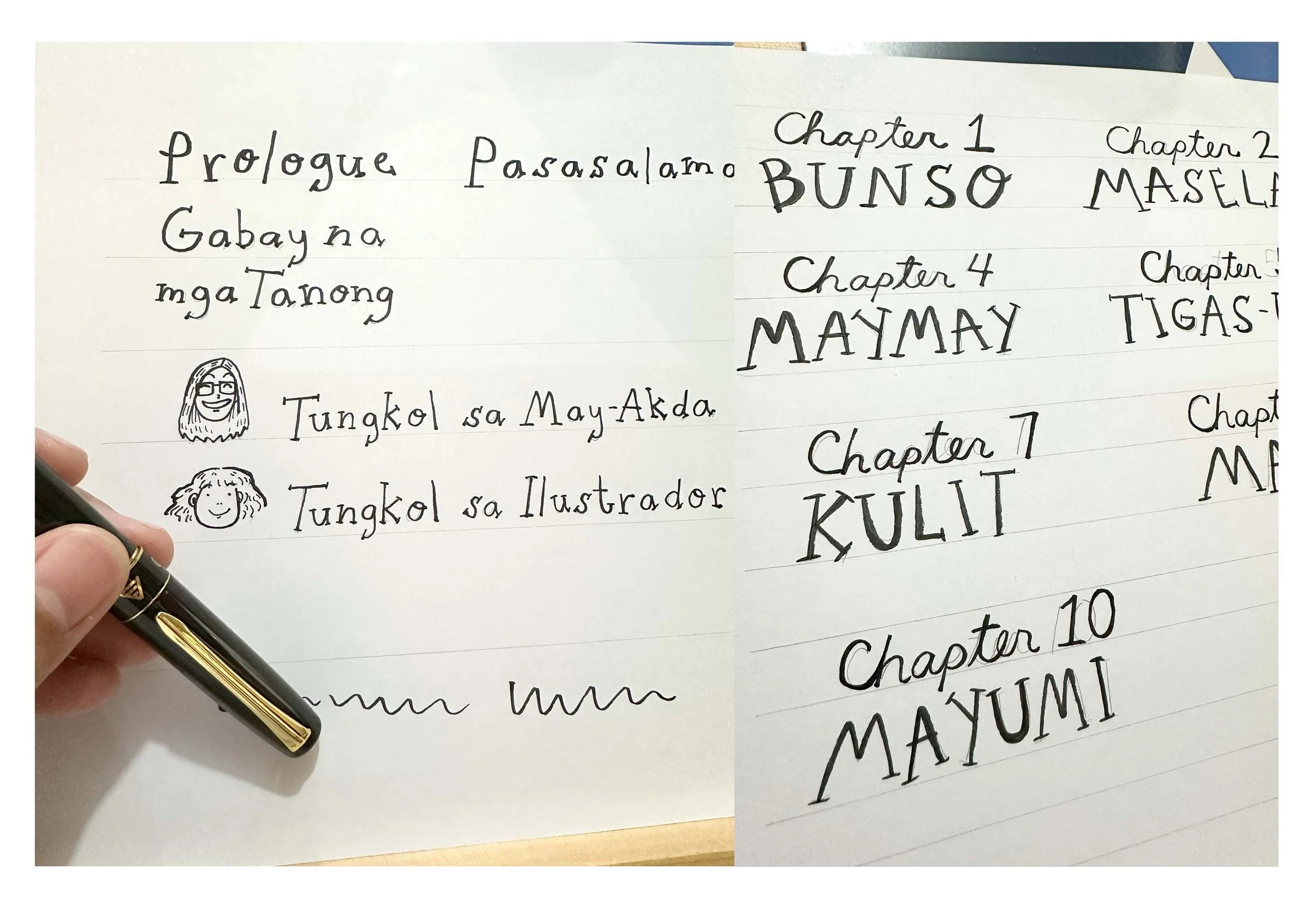
Mayumi is conflicted with her name and the supposed embodiment of what it means, so a contrast of neat and cursive handwriting and an all caps, serif, and bold text represented this! We used this treatment on the book title design and the chapter titles in the inside pages.
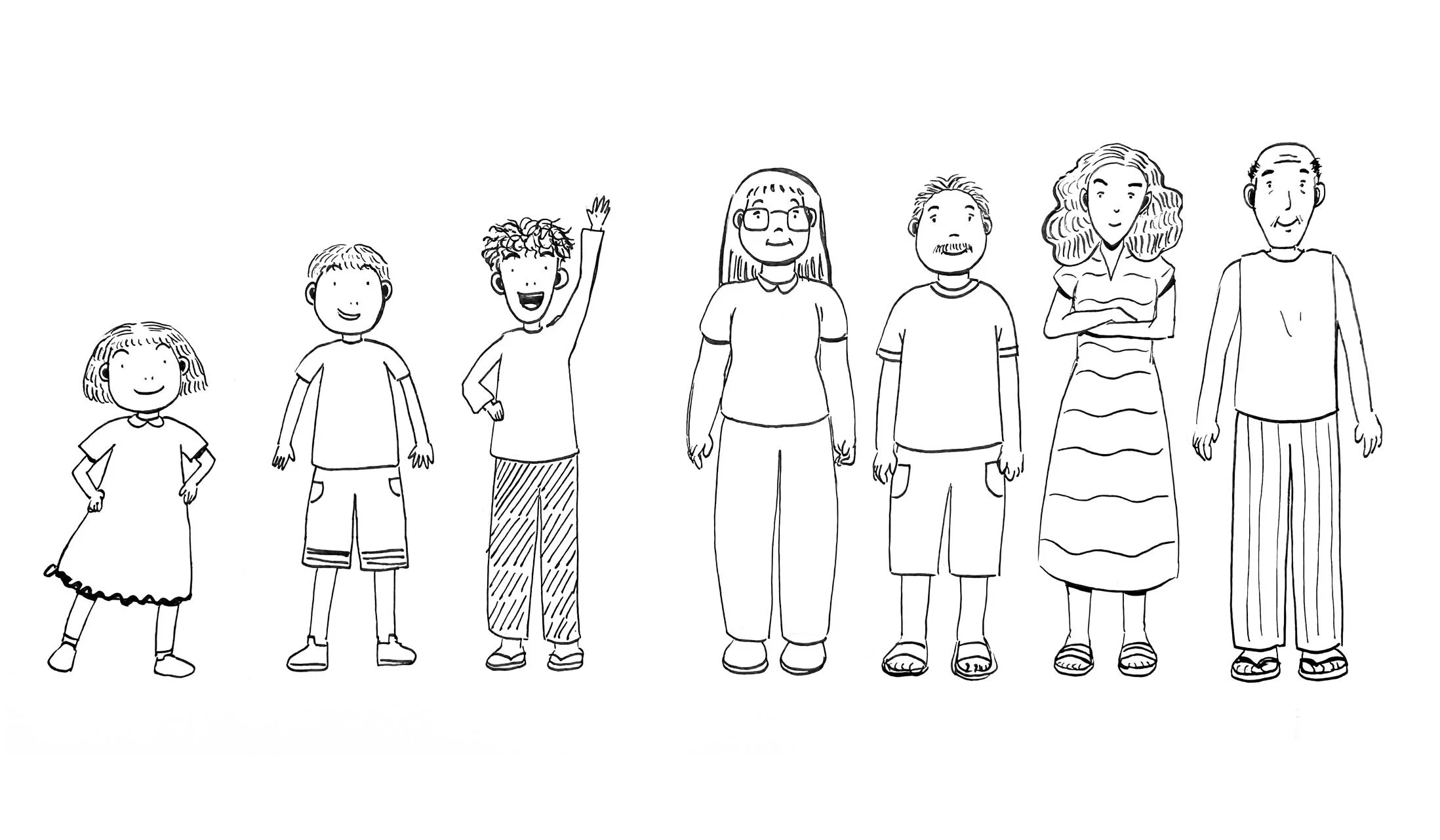
Mayumi has a bob cut and short bangs; her hair is parted in the middle to supplement her supposed image of being mahinhin/maayos. Her white bestida has a cute collar and ruffles at the bottom of her dress; it could show the story’s progression and Mayumi’s inner conflict using her dress as a sort of canvas and storytelling device! I also kept her short to show the pressure she feels when the rest of the family invokes her name’s meaning when she’s being otherwise!
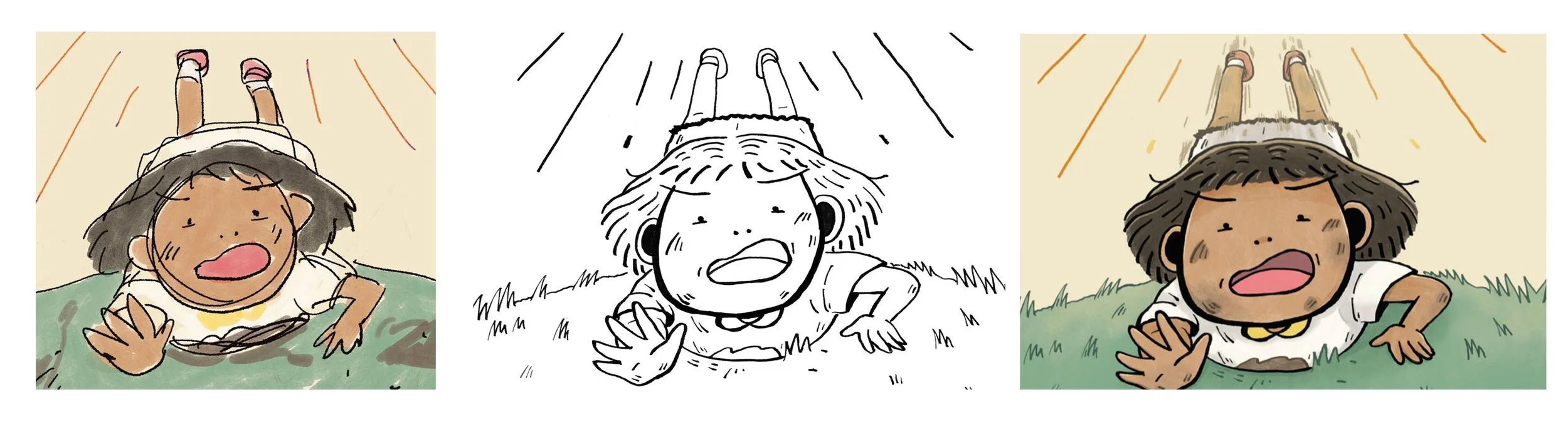
When the team gave the go signal for the characters, we proceeded to the covers! I proposed three colored rough sketches, and we went with the one that shows a scene in the story. It goes with the theme of contrast!
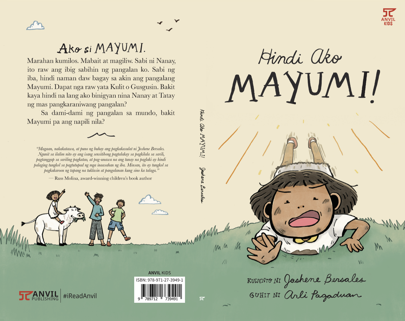
There’s a bit of dirt and lots of grass to establish the provincial setting. At the back cover, Mayumi is with her Kuya Marco and Kuya Sandy. She rides on top of the white cow Kulas, just having fun, playing around, and truly defying the meaning of her name!
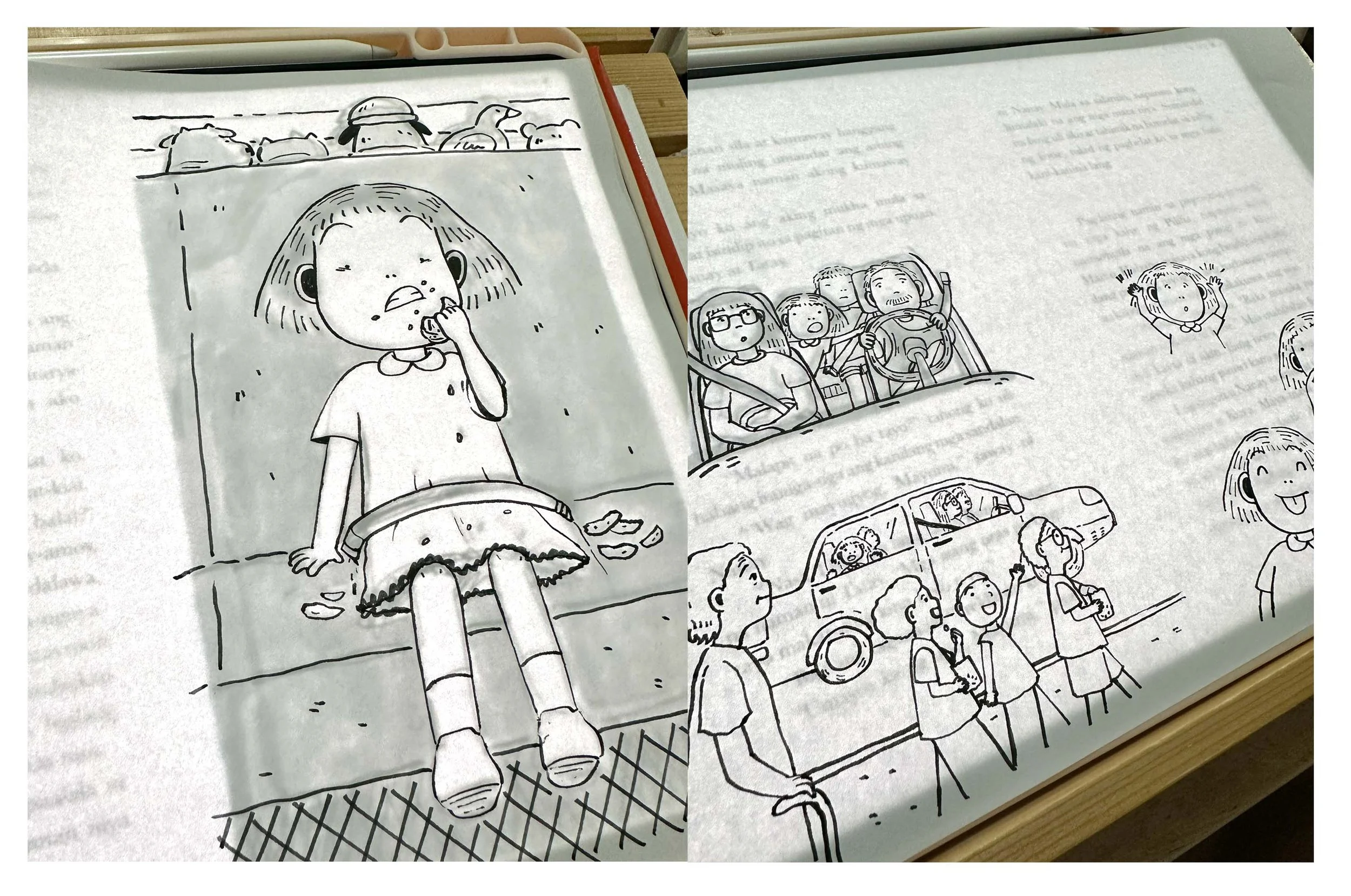
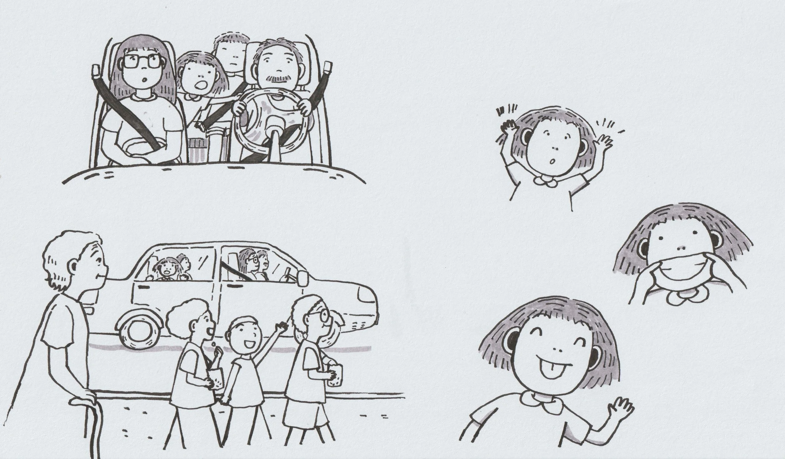
For the inside illustrations, I did the rough sketches on a tablet and once they were approved, I inked them on bond paper and used a marker to color some areas. I used the tablet as a lightbox, so I could easily follow the rough sketch as a guide!
I made sure that the line art would be clean enough, so there would be only a little digital enhancement to be done. After scanning them, I placed them on the existing layout on Adobe InDesign. Prior to making the rough sketches of the inside illustrations, I placed the texts already on the program, so I could plan how to draw the illustrations.
Lastly, we used small drawings that symbolize elements in the story on the textured endpapers!